
Heritage Line Up! by notcheight
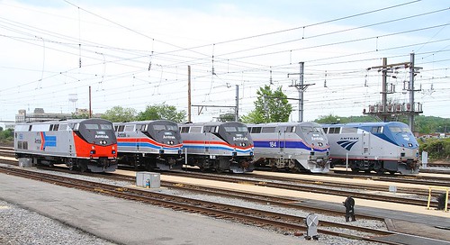
Phases I through V lined up left to right.
Amtrak #156 by lukibob17

Phase I is still my least-favorite - I thought it was ugly the first time around, and it doesn't adapt well to the lines of the P40s. The old logo is still much nicer than the stupid swooshes at least (though I'd change a few details like the text placement and spacing of the lines...).
Rounding the curve Amtrak #66 by kschmidt626
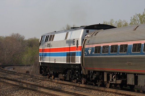
Phase II was definitely a product of it's day and I always felt that it aged poorly to my "modern" eyes. Of course, my early opinions were clearly colored by my feelings on the designs from the early Amtrak days in general. I actually think this unit shows it off far better than the original F40PH's did, and certainly better than the Superliner's adaptation.
45 Pace close by notcheight
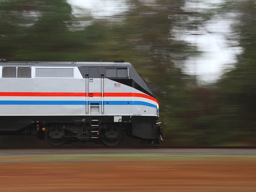
Phase III has always felt tired and cliche to me, but I think that's because it was the 'old' scheme when I was growing up. It's definitely the most classic and recognizably-Amtrak versions and I have developed a growing respect for it. It does work very well on the lines of the AMD-103s.
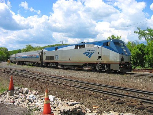
Untitled by akagoldfish

Phase IV has always been my favorite, especially some of the later versions (many still actively in use). I'm curious how well this design will age when I look back in 20 or 40 years.
2005-5-30 Palmer 91 by traingeek
And finally phase V (included for completeness even though I don't believe Amtrak has marked one for the 40th Anniversary). They feel like a weak austere attempt to mimic the Acela scheme without really suiting the different form of the AMD-103s. Some of the newer versions of phase V are notably better and feel more elegant and classy in comparison, though most of the adaptations to other locomotives like the AEM-7s are just bland. It's amazing what a difference small details like the reflective trim and lines of the engine make. (I also don't like how for the past decade or so the designs have been so fragmented across regions and types of equipment. I prefer how a lot of them look, but it's aggravatingly-inconsistent.)
I haven't been following the news, so I don't know but I'm guessing Amtrak won't do some of the more obscure schemes like the P32-8's Pepsi Can or the original AMD-103 "phase IIIb" fade designs. And certainly not the specifics like Amtrak California's stuff. Still, it is always fun to see old designs adapted to new units that have very different shapes and aesthetic considerations.


No comments:
Post a Comment
Note: Only a member of this blog may post a comment.